A new
visual identity for
the circular economy
A rebranding for Wecycle

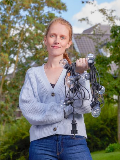
Wherever you encounter Wecycle, we aim to inspire and encourage people with a positive nudge. The visual identity is designed to be dynamic and uplifting—guiding you effortlessly toward smarter recycling choices.
Introduction
Inspired by the core idea "Hand in your electronic waste, and something new will come from it," we created Wecycle’s new branded identity—built on the power of renewal.
Stronger brand recognition enhances visibility across communications, return locations, and owned channels. A modular design system ensures consistency, while sub-brands like Kids and Business seamlessly integrate into the logo, keeping the identity unified.
Wherever you encounter Wecycle, we aim to inspire and encourage with a positive nudge. The dynamic and uplifting design makes recycling feel effortless and rewarding, reinforcing the impact of small, sustainable actions.
Our design language is inspired by the 'W' and symbolizes the path to renewal.
Norman Groenewegen
Creative Director


How design can meaningfully contribute to the circular economy.


Our design reflects the positive energy of recycling with a lively, upbeat tone.